
Your Cart is Empty
Explore our newest colors - free samples available
Explore our newest colors - free samples available
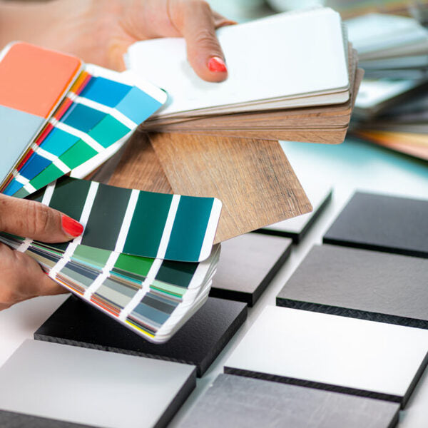
![]()
Choosing a color palette for your kitchen is both exciting and daunting. Color influences the tone and personality of your home's most important space. Are you inclined towards a bold statement that energizes, or do you prefer a more subtle, timeless backdrop? It's a choice that reflects your style, values, and how you want to experience your kitchen. Do you see your kitchen as a vibrant hub of creativity, or is it meant to be a tranquil retreat of culinary zen?
In this piece, we’ll explore kitchen color palettes, from the bold to the understated, examining the distinct merits of each approach. By the end, you'll have a better grasp of which path aligns with your vision for your kitchen, the heart of your home.
Let's begin.
Color is a powerful design element that is crucial in defining a kitchen's ambiance, personality, and functionality. It can evoke emotions, set the tone, and create a cohesive and inviting space. When deciding on your kitchen's color palette, understanding the role of color is essential. Here's a list of how color influences kitchen design:
Choosing a color palette for your kitchen is a critical decision that can significantly impact the overall look and feel of the space. Two popular approaches to kitchen color palettes are "daring" and "subtle." These palettes represent distinct design styles and can set the tone for your kitchen's personality. Let's define these two contrasting approaches:
Saturated, vibrant, and attention-grabbing colors characterize daring kitchen color palettes. These palettes are confident and adventurous, pushing the boundaries of traditional kitchen design. They often feature bright, bold colors such as fiery reds, electric blues, vivid yellows, or energetic oranges.

Daring color palettes are expressive and reflect the homeowner's personality, and they are often chosen by individuals who are not afraid to make a bold design statement. Daring kitchens often include statement pieces like colorful range hood appliances, eye-catching light fixtures, or bold artwork.
Subtle kitchen color palettes, on the other hand, are characterized by understated, muted, and soothing tones. These palettes prioritize harmony, timelessness, and a sense of calm and appeal to those who appreciate enduring design aesthetics that transcend trends. It favors soft and neutral colors like whites, grays, beiges, and pastels that create a sense of tranquility and openness in the kitchen.
Subtle palettes promote minimalism and decluttered spaces with monochromatic or tonal color schemes, where various shades of a single color are used throughout the space. Cabinets and countertops are often simple and unadorned, emphasizing clean lines and functionality. Subtle kitchens may incorporate natural materials like wood, stone, and glass to add warmth and texture to the space.
Choosing the right color palette for your kitchen is a nuanced process beyond personal preference. It's essential to consider various factors specific to your kitchen space, as these considerations will help you determine whether to opt for a daring and vibrant color scheme or a more subtle and muted one. Here’s what to note when assessing your kitchen space:
The size and layout of your kitchen play a crucial role in choosing the right color palette. In smaller kitchens, light and neutral colors like white, light gray, or soft pastels can visually expand the area and create a sense of spaciousness and airiness. Conversely, you can experiment with bolder colors in larger kitchens, such as rich blues, deep greens, or warm reds, adding character and coziness to larger kitchen spaces.
Natural light profoundly affects how colors are perceived in your kitchen. Consider the orientation of your kitchen and the amount of natural light it receives throughout the day. South-facing kitchens tend to receive more direct sunlight and can handle bolder colors well. In contrast, north-facing kitchens may benefit from lighter shades to counterbalance limited natural light. Pay attention to how your chosen colors appear under different lighting conditions to ensure they match your desired aesthetic.
Assess your kitchen's existing fixtures and materials, as they can influence your color choices. Consider how your chosen color palette complements these elements if you have hardwood floors, granite countertops, or cabinetry with a specific finish. Select colors that harmonize with the existing materials, creating a cohesive and well-coordinated look. For example, mint green cabinets or countertops can create a fresh, clean look that complements dark blue cabinets.
Additionally, consider the color of kitchen appliances, particularly if they are built-in or challenging to replace. Stainless steel appliances pair well with various color palettes, while colored appliances may require more careful consideration.
Daring color choices in the kitchen can create a space that is both stylish and unique, and if you are bold enough to experiment with color, there are a few different ways to incorporate it into your kitchen design. If you're considering daring colors, here are three key areas where you can introduce them: bold wall colors, vibrant cabinet hardware, and colorful backsplashes.
One of the most impactful ways to introduce daring colors into your kitchen is by selecting bold wall colors. Instead of sticking to the traditional neutrals or darker shades, consider painting your kitchen walls with vivid hues such as deep reds, electric blues, or rich emerald greens. These bold choices can instantly transform your kitchen into a captivating and vibrant space.
Whether cherry red, brick red, or even a deep burgundy, red can create a passionate and dynamic kitchen atmosphere that stimulates appetite and conversation. Blues like calming pastels and striking navy blues evoke serenity and freshness, making them an excellent choice for kitchens where relaxation and creativity are valued. Green hues, especially darker and richer tones, bring a sense of nature and tranquility to the kitchen. They work well with natural materials like wood and stone, creating a harmonious and inviting space.
While using bold wall color options, it should still harmonize with the overall theme of your kitchen. Consider complementary or analogous color schemes to maintain balance and cohesion. For instance, a bold red wall can work with white or gray cabinets for a contemporary look. If you're hesitant about permanently committing to a daring wall color, removable wallpaper or peel-and-stick decals offer a temporary way to experiment with bold shades without the long-term commitment.
You can inject daring colors through your cabinet hardware if you prefer a more subtle kitchen backdrop. Vibrant and colorful cabinet knobs, handles, and pulls can act as small but impactful accents in your kitchen design. Consider cabinet hardware in bold brass or gold finishes, as these metallic hues add warmth and elegance to your kitchen while making a statement. For those who are interested, ModernCopper offers brass range hoods and copper range hoods. Explore cabinet hardware made from colorful resins or acrylic materials, which come in various bold colors and unique shapes, allowing you to express your personality.
Mixing and matching cabinet hardware colors can create a visually dynamic kitchen. For instance, a combination of bold red, deep blue, and vibrant yellow hardware can add a playful and eclectic touch to your cabinetry. Also, don't hesitate to personalize your existing hardware in bold, contrasting colors. This DIY approach can instantly refresh the look of your kitchen cabinets without a major renovation.
Another area where you can introduce daring colors is your kitchen backsplash. Vibrant and colorful backsplashes can become a focal point in your kitchen, adding character and personality to the space. Consider mosaic tiles with intricate patterns and a mix of bold colors, which creates a visually stimulating and artistic backsplash that draws attention. Opt for colorful subway tile backsplash options in shades like aqua, coral, or mustard for a fresh, unexpected twist on a timeless design. Explore hand-painted tiles with custom designs and accent color choices if you want a truly unique touch. You can opt for a single bold color or mix and match different colored tiles to create a unique pattern.

Subtle color choices featuring neutral tones, soft pastels, and monochromatic schemes offer beauty, style, and versatility in your kitchen design. They bring a timeless and serene ambiance. Here's how to effectively incorporate these understated color palettes:
Neutral colors, such as beige, gray, and white, form the foundation of many classic kitchen designs. These versatile tones can create a sense of balance in your space. For example, white cabinets with gray or beige walls create a clean and timeless look that can adapt to various design styles. Neutrals work well with natural elements like wood, stone, or marble. For example, combining warm wood tones with soft gray or beige creates an elegant and harmonious aesthetic.
Soft pastel colors, such as pale blue, mint green, or blush pink, can infuse your kitchen with subtle elegance. These light colors evoke a soothing and airy ambiance. Incorporate pastels as accents through kitchen accessories, such as dishware, linens, or small appliances. These pops of color can add a touch of personality without overwhelming the space. To maintain a cohesive look, choose one or two pastel shades that complement each other and work well with your existing kitchen materials and finishes.
A monochromatic color scheme creates a cohesive and understated look by utilizing various shades and tones of a single color. This approach enhances the sophistication and depth of your kitchen design, providing a nuanced and layered appearance by manipulating diverse shades and textures within the same color family. Introduce texture using elements like subway tiles, shaker cabinets, or patterned fabrics to prevent a monochromatic kitchen from appearing flat.
Designing your kitchen's color palette doesn't have to be an all-or-nothing decision. Combining daring and subtle elements in your kitchen design can strike a harmonious balance. This approach allows you to infuse energy and personality while maintaining a sense of sophistication and tranquility. Here are some strategies for combining daring and subtle elements in your kitchen design:
Consider designing one wall in your kitchen as a feature wall to serve as the room's focal point. Daring color options like vibrant red, deep navy, or glossy black can be captivating. Speaking of which, ModenCopper has a great collection of black range hoods. Another option is to make your colorful kitchen island the centerpiece, while the surrounding cabinets may feature subtle, neutral tones. To maintain balance, ensure that the rest of the kitchen's color palette, including cabinets and countertops, complements the bold feature. Subtle, neutral colors surrounding the daring element will create a harmonious contrast.

Another way to blend daring and subtle elements is through accents and accessories. These small yet impactful details can inject personality and vibrancy into your kitchen while subduing the palette. Brightly colored dishes, colorful small appliances, or vibrant textiles like curtains and seat cushions can add energy and personality to a primarily subtle kitchen. Daring accents and accessories offer flexibility, allowing you to adapt the kitchen's look and feel to match your mood and the changing seasons.
Balancing daring and subtle elements often comes down to creating visual contrast within your kitchen design. This contrast can highlight specific areas or features while maintaining an overall sense of cohesion. Pair bold colors with neutral tones to create high contrast. For example, dark cabinets paired with a white subway tile backsplash create a striking contrast that emphasizes the design's subtlety and daringness.
Selecting a color palette for your kitchen involves more than just choosing one hue; understanding color combinations and schemes can help you achieve a harmonious and visually appealing design. Complementary, analogous, and triadic color schemes are three popular schemes to consider when deciding between daring or subtle choices. Here's how to use each effectively in your kitchen design:
Complementary colors are pairs of colors that sit opposite each other on the color wheel, creating strong contrast and visual impact. Examples include blue and orange, red and green, or yellow and purple. Consider using complementary color combinations in your kitchen to introduce a daring and energetic vibe. For instance, you might use bold blue cabinets with vibrant orange accents or red barstools against green walls. Ensure that most of your kitchen remains in subtle, neutral tones to prevent overwhelming the space. The complementary colors serve as accent elements that add drama and personality.
Analogous colors are hues adjacent to each other on the color wheel. These schemes create a sense of harmony and cohesion in your kitchen design. Analogous color combinations can be either daring or subtle, depending on the specific shades you choose. They are ideal for those who prefer subtlety and a sense of cohesion in their kitchen. Soft pastel shades or muted tones can create a calming and welcoming atmosphere. While analogous schemes are generally subtle, you can introduce a touch of daring by selecting one slightly more vibrant color within the analogous range.
Triadic color schemes involve three colors evenly spaced around the color wheel, creating a balanced and dynamic look. Common triads include red, yellow, blue, orange, green, and purple combinations. Triadic schemes are daring and vibrant by nature, making them suitable for homeowners who want to infuse their kitchen with energy and excitement. For instance, you might have red cabinets, yellow walls, and blue accents. Despite their boldness, triadic schemes can achieve harmony by using varying shades and tones of each color. Balance is essential to prevent the kitchen from feeling overwhelming.
With color schemes, lighting matters, so asses the amount of natural light in your kitchen when choosing color schemes. Adequate lighting with pendant lights can enhance the impact of daring colors, while softer, subtle colors may require less light to shine.
Choosing your kitchen's color palette is a significant decision that can significantly impact the overall look and feel of the space. Daring color choices can inject energy and personality into your kitchen, making it a vibrant and expressive space. On the other hand, subtle color choices offer a sense of tranquility and timeless elegance. For those who wish to blend daring and subtle elements, there are various strategies to consider. Ultimately, your kitchen's color palette should align with your personal preferences and lifestyle, reflect your unique style, and be a space where you feel comfortable and inspired.